Reduce User Friction, Increase Customer Satisfaction
The website is the storefront of eCommerce businesses. To increase the likelihood of sales and returning customers, the journey through it needs to be as easy to use as possible. When customers experience friction, there is a high likelihood that they will stop their journey with you. Let’s explore how to ensure you have the optimal user journey and retain loyal customers.
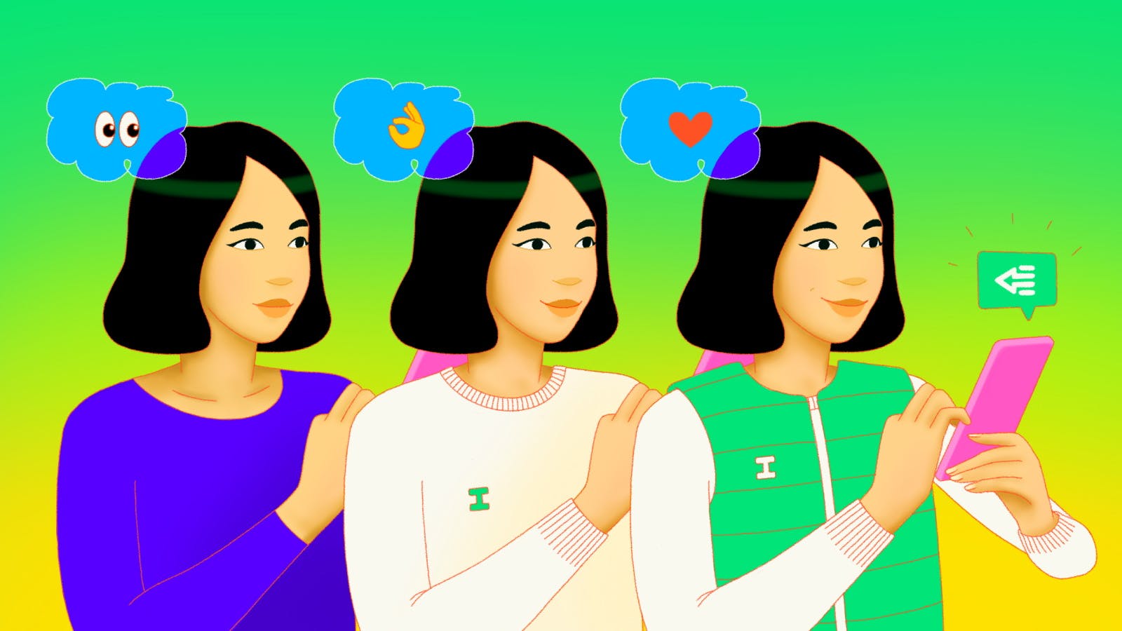
User friction can happen in many different ways, but essentially, it’s when a user experiences difficulties in completing the customer journey, often so much so that the end goal cannot be achieved.
We’ve all been there, we see an advertisement, go through the website and evaluate whether the product is right for us, and finally decide to purchase. But, then we’re bombarded with prompts to add-on 10 different items at the cart, or we can’t progress without signing up to be a member. Even when our payment methods aren’t saved or recognised in the store – the effort to go and find that card is sometimes just too much! These points of user friction may seem minor to many businesses, but it’s a point of churn for many of us customers. “I came to the site to purchase, just let me do that.”
There are three types of user friction to be aware of:
Emotional friction – the feelings the customer experiences through the user journey that prevents the goal from being achieved. As this is an individual feeling, triggered by many differing factors, it can be the hardest to account for. Often it can cause discomfort and lack of trust in a brand. eg: whether or not the customer agrees with the values of the eCommerce business, or the image that is used offends.
Cognitive friction – tasks that require a lot of brain power. eCommerce businesses spend considerable time trying to reduce this and make the purchasing process as simple as possible. One common one that we’ve all been caught out by is currency conversion. Another is a subscription that is reduced when paid annually but the annual cost is not clear, you go and grab the calculator and break it down yourself – wouldn’t it be easier to see it on the screen in the first place?
Interaction friction – the usability of your service and how it may prevent the goals from being reached. Usability testing is how to identify and work towards lessening these incidences. eg: I keep getting pop-ups on the website or I can’t zoom in to see the details on a t-shirt.
eCommerce businesses need to think about what the goals are in the customer journey (in addition to selling products of course), these may include growing memberships, boosting subscription sign ups or increasing Instagram followers. How do you seamlessly guide a customer through your site to the point of purchase while subtly achieving your goals? It’s not easy, but there are companies out there who do it well.
Let’s take a look at a well-known retailer of bedding and homewares, Adairs. I go to their website, see the search bar presented straight in front of me, I search for a blanket, find what I want and go to checkout. I’m offered to become a member of their club OR continue to checkout. There are many businesses who force becoming a member, and cause distrust and apprehension to buy.
Similarly, Rebel Sport’s website allows me to quickly find and add a product to the cart. When I do so, I’m presented with a notification that it’s been added and then displays some additional products that I might be interested in. This is a subtle upsell opportunity that’s tied in with a notification I would expect. There is a clear button to continue shopping or purchase and so, I’m not put off by the upsell offers because my user journey isn’t impacted.
The Customer Journey
So, let’s think about the journey, firstly, the discovery phase of your brand – how are people finding you? What do they see when they first arrive on your site? Many points of friction in this stage can be around the pop-up asking you to subscribe and get 10% off – can I just take a look around first before subscribing? Geeze… Or what about a site that takes more than 10 seconds to load. The discovery phase is your opportunity to hook people in and showcase your brand, so make it as seamless as possible. Be sure to test all three types of friction to ensure you can help customers through the site.
And then, a customer has learnt about the brand and product, made it through evaluation to the purchase phase, but wait! The site doesn’t offer Buy Now Pay Later options, my items haven’t been added to the shopping cart, or I need to provide too many points of ID. These experiences can really impact your bottom line and customer loyalty.
Instant was born from the need to reduce all types of user friction. It solves for all the issues of customer drop off during purchase. The myriad of fields, passwords, accounts or even the need to have to find a physical card to complete the purchase is too much. There is a better experience with Instant making it 4 x faster to complete a purchase. You can make an “Instant Purchase” from within the product page of the site (removing the add to bag step), new users do need to input their information – only once. From then on, Instant knows you and allows you to just buy – no crazy amount of info required!
PLUS, if a buyer needs to edit or cancel the order, they can do so within 5 minutes. Also, order batching allows you to add more products to the purchase you’d just made so that it can get delivered altogether. We’ve undertaken a lot of research to ensure we’re reducing all the friction points – and we’re part of the solution for our customers!
You cannot be successful in reducing user friction unless you listen to the voice of the customer – do constant research and evolve based on what you discover, and then research again. Read our tips on how to conduct research.